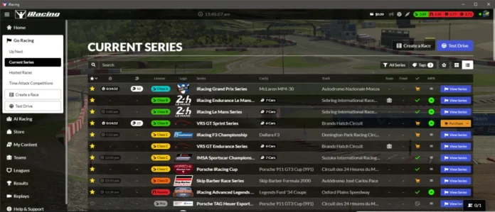
In the world of technology and software, change is something that always happens and keeps going on. But, when it comes to the user interface (UI) of a beloved platform, not everyone is ready to easily accept the new look. This has been the case with iRacing’s interface, which has caused a mix of reactions among its users. Let’s take a closer look at the opinions and reasons behind this division.
- Remember, you can join iRacing clicking here.
Since the new user interface was introduced, many users in the community have expressed their unhappiness with the changes. They are not alone in feeling this way, as some other iRacing community members share the same concerns and dissatisfaction with the updated interface. They have also pointed out that similar problems have been seen in other racing game platforms, suggesting that iRacing’s user interface is not the only one that has faced criticism.

One significant factor contributing to the negative reaction is resistance to change. As with many updates, some users may find it difficult to adapt to the new interface after being used to the previous version for many years. We should remember that there have been iRacing users since 2008. Familiarity with the old interface can make the transition complicated and lead to some resistance to the changes.

On the other hand, new users from recent years seem to be happy with the modern and appealing appearance of the new user interface. They are excited about the ongoing improvements and new features that the interface keeps getting. Other users have also expressed that they prefer the new interface to the old one, finding it a more enjoyable and up-to-date experience.

The debate about the functionality and features of the new user interface compared to the old web interface is still going on. Both versions of the user interface have their strengths and weaknesses. Many users acknowledge the modern appearance of the new user interface but also point out that it could be simplified even further for a better user experience.

It’s essential to consider user feedback and continuously strive to improve the user experience to meet the diverse needs of the iRacing community. Ultimately, the goal should be to provide a user interface that is both functional and attractive, creating a rewarding and enjoyable experience for all users of the platform.
What is your opinion about iRacing’s user interface?
See you on the track!
This website uses affiliate links which may earn a commission at no additional cost to you.


