In past articles, we were talking about the disaster decision to create an alternative interface for iRacing When all services/sims looked to transform their applications into web services, iRacing did just the opposite.
It seems that the iRacing staff continue to insist on not renewing the website, not renewing the game’s HUD and not updating anything that currently works and has been tremendously practical for 10 years.
Joachim Ljunggren has made some sketches on how certain design decisions could be improved by showing several screens where really substantial changes are appreciated, most of which include improvements:
I have been following the Beta UI development for a long time. Until the last big update roughly a year ago (when the option to make it white arrived), I was a bit frustrated with it.
The biggest issue for me is the website looks horrible. Old design, cluttered, small, hard to find stuff etc. The Beta UI is much better in that aspect. However using two systems at once is problematic. I would love to see a big push to get the Beta UI finished and then just get rid of the website once and for all.
I was so frustrated with the Beta UI until one year ago as I wrote above that I simply decided to make a mock up of how I would like it to work. Then the update came and I kind of liked it but it could be so much more. Trying to make it more streamlined, fewer clicks, easier to understand, etc. But I decided never to show my mock up because I didn’t saw the point. Reading in the other thread staff wanting feedback I decided to post this anyway.
So here it is, some parts are just the first version, some parts are a bit more refined. Everything could of course be worked on even more:
Welcome
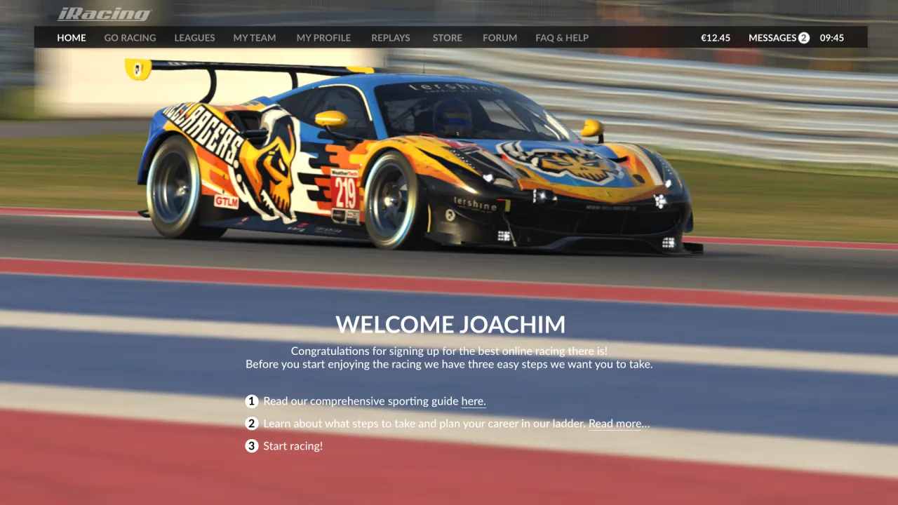
Welcome screen for newcomers. Something to guide them on how iRacing works, etc. Only shown the first time after you sign up.
Home screen
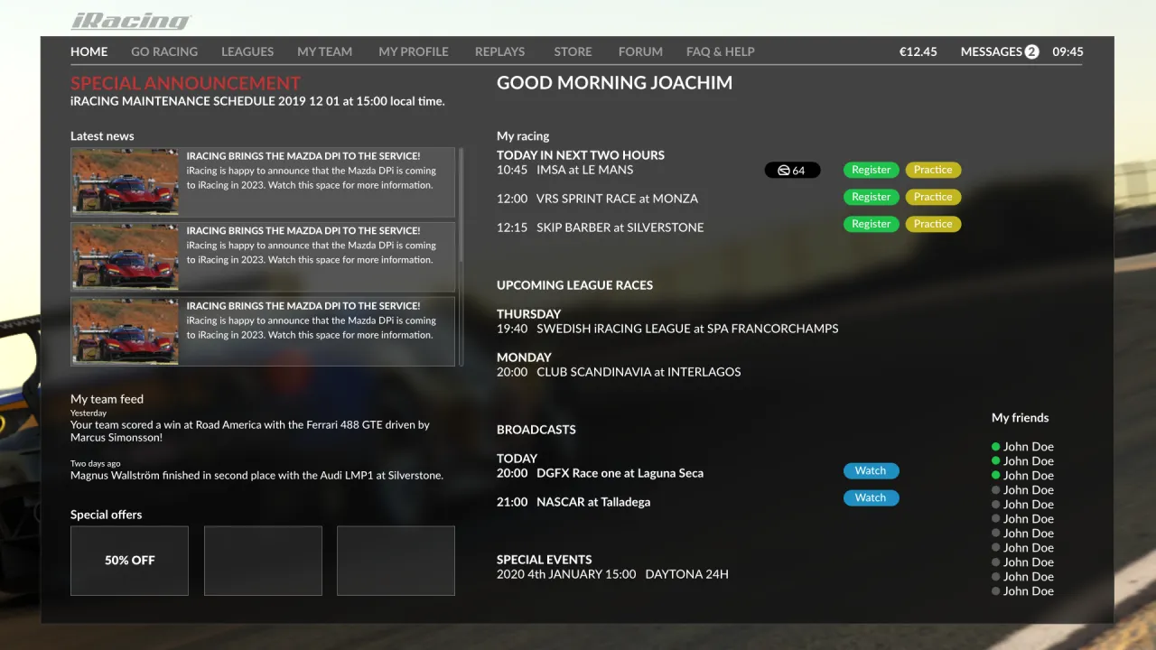
Here is the most important place in the UI. Your personalised home screen. It should be highly configurable showing only the stuff you want to see and race. Look at it as a “to do list” for the racing today. The usual official racing and the next league race and other news are presented here. And all can be joined with one click.
Sponsored series
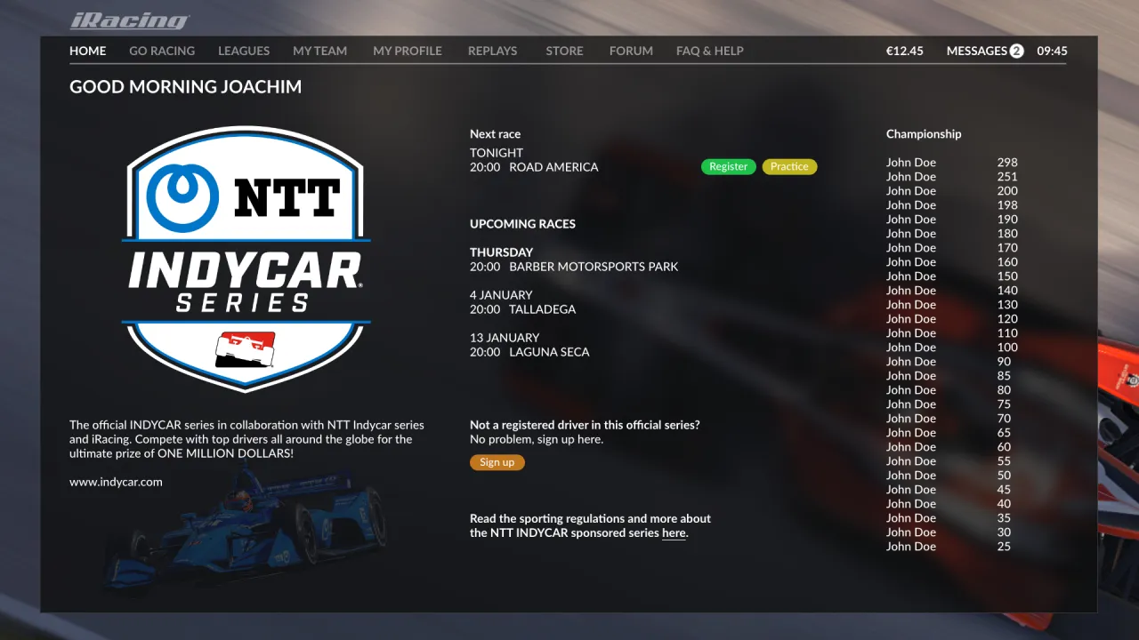
Some way of presenting the main sponsor of the series in a much better way. Get rid of everything else and focus on the sponsor. I guess it could bring more money to iRacing because of big logos.
My profile
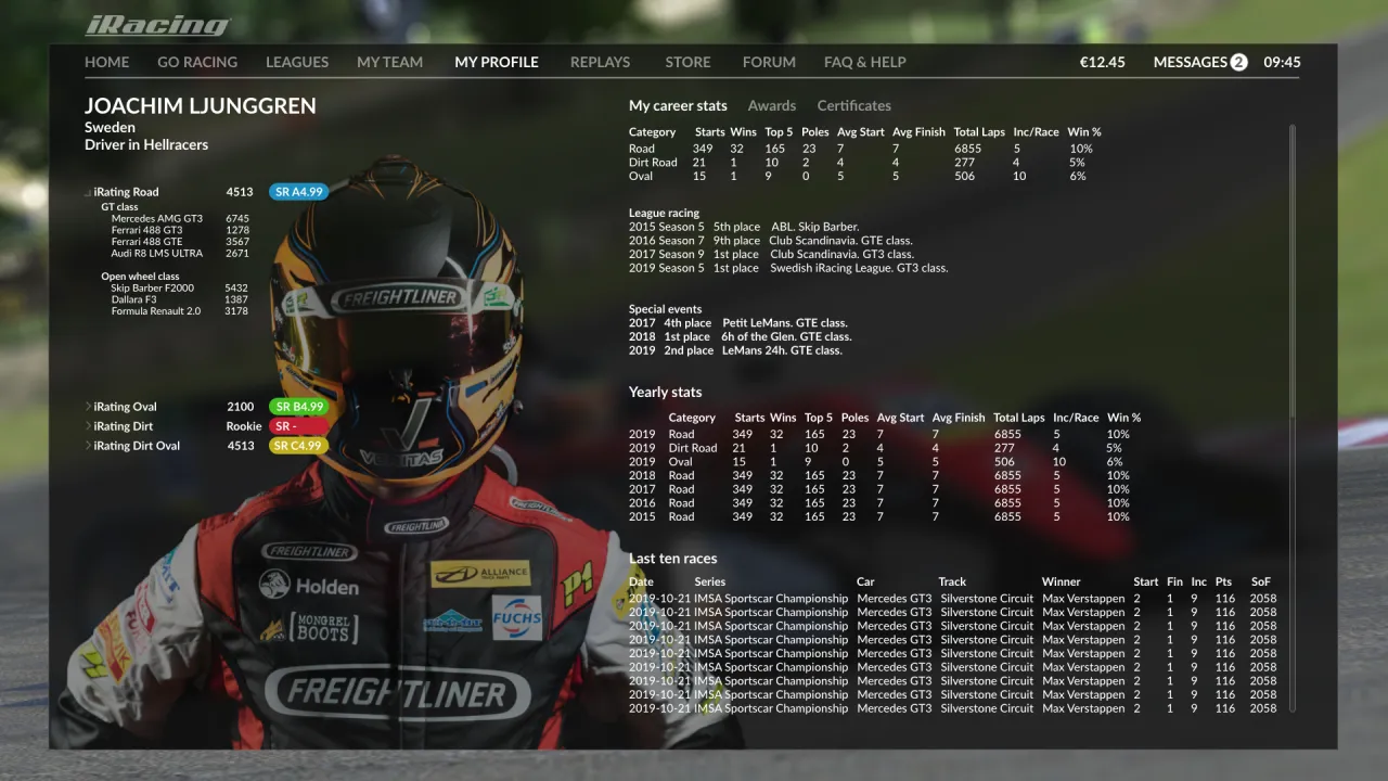
Track loading screen
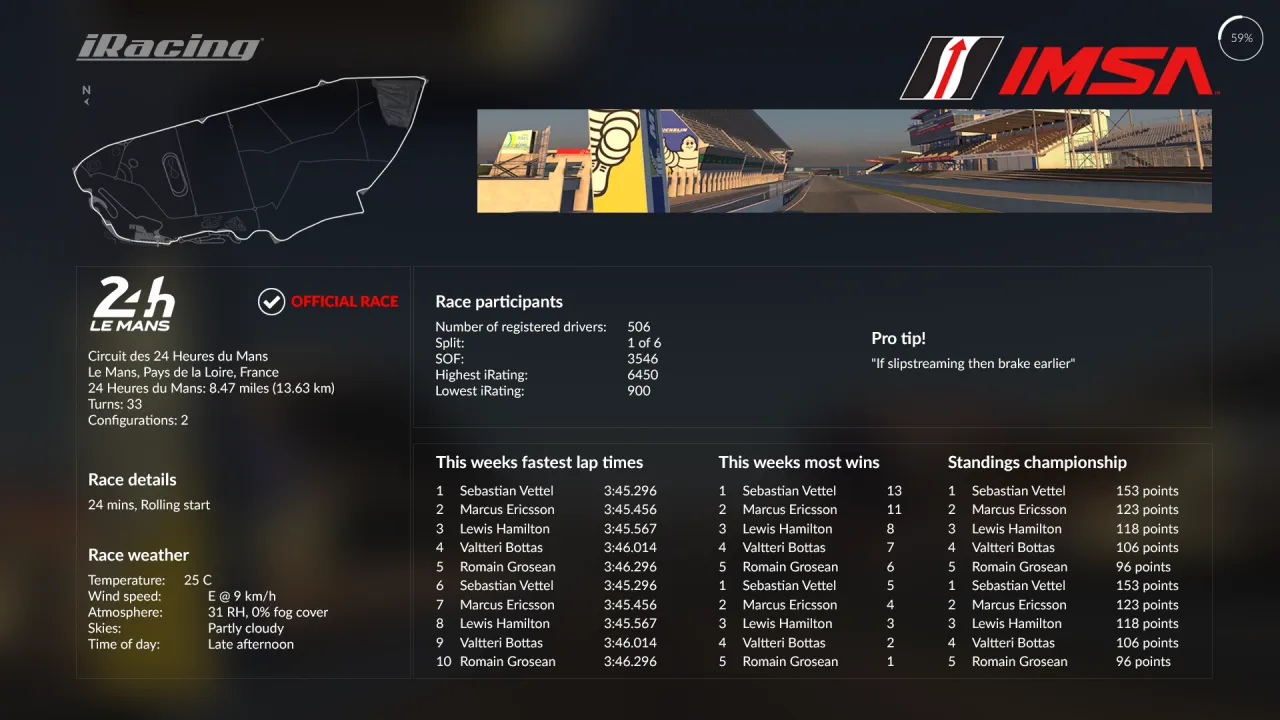
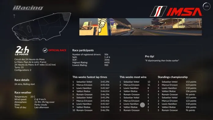
Do something interesting with the screen we stare at while loading. Use it for some nice live stats for the week, weather, facts, etc. The data is there, use it.
In game UI
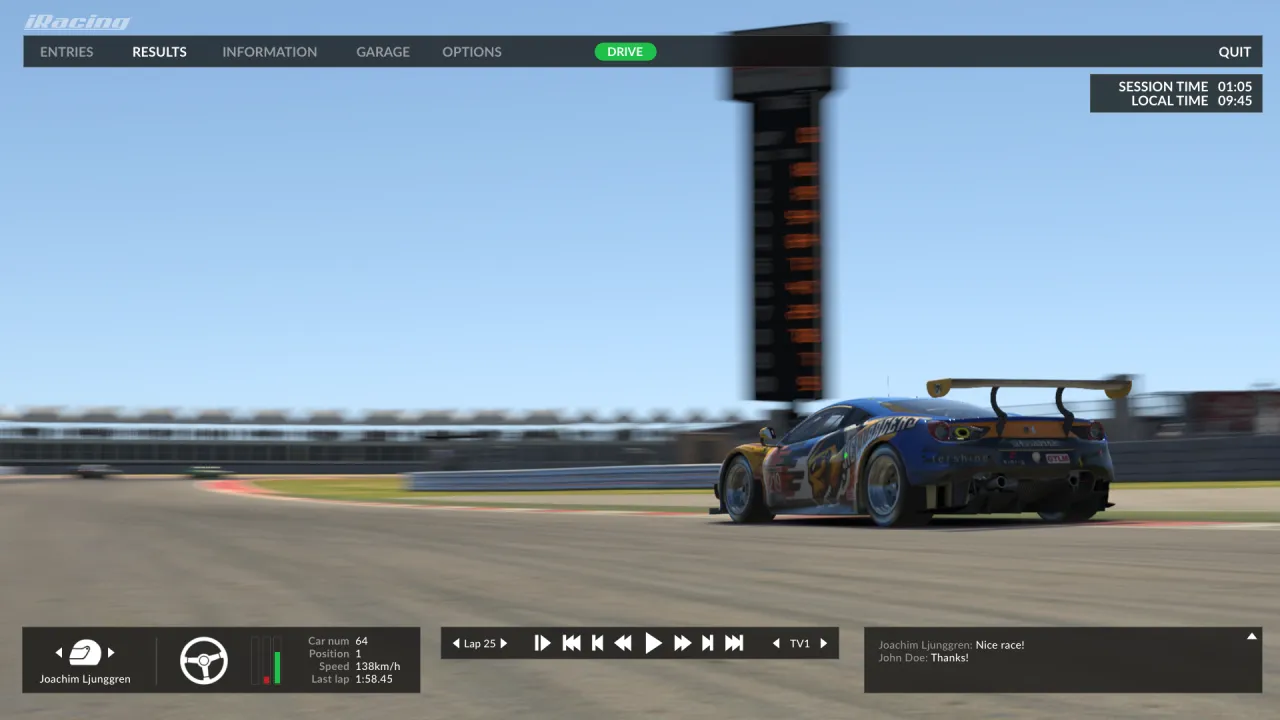
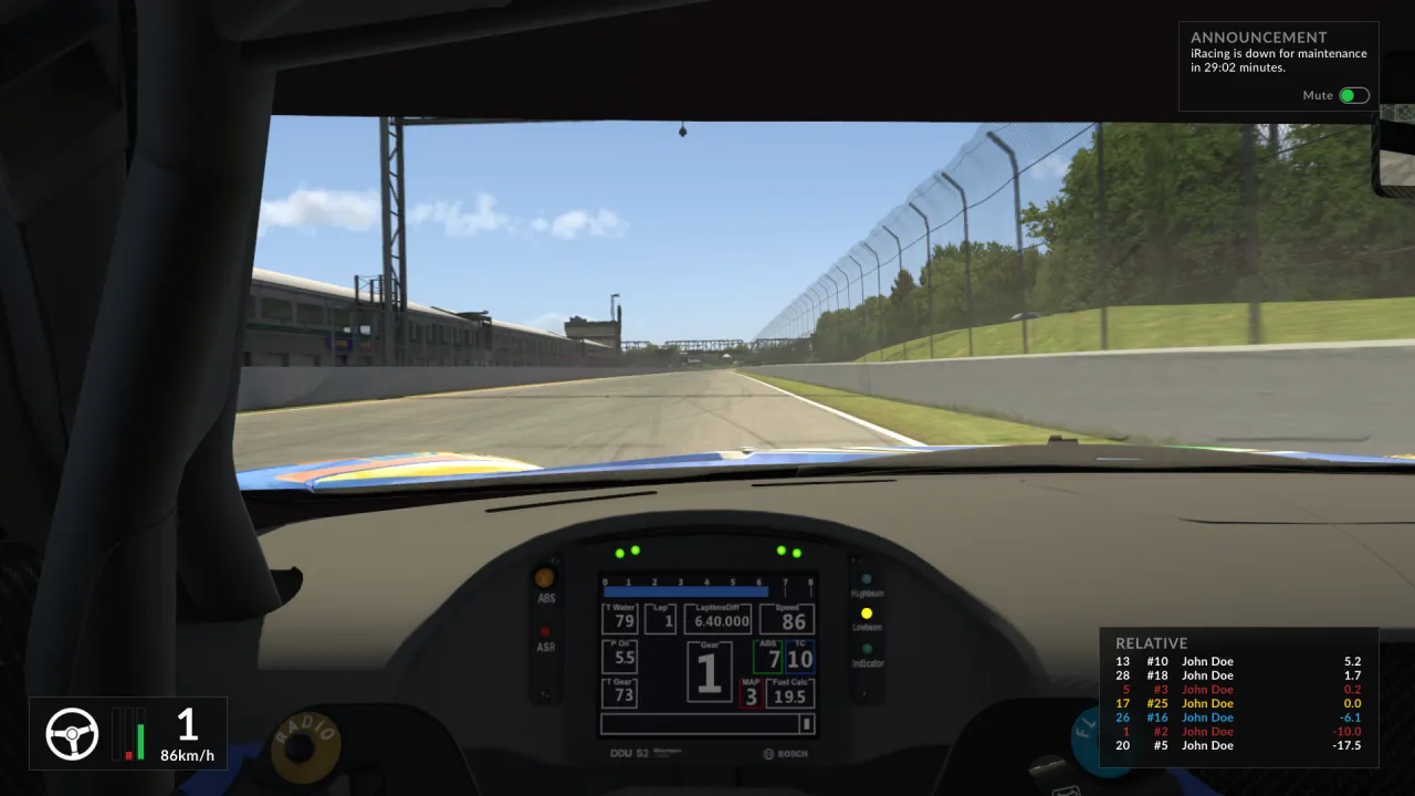
And finally the UI in game. Make it look like the Beta UI! With some added things like my local time, important announcements etc. Of course you can turn these things off if you don’t want that info.
You can follow the comments in the official iRacing forum thread here.
See you on the track!
This website uses affiliate links which may earn a commission at no additional cost to you.
